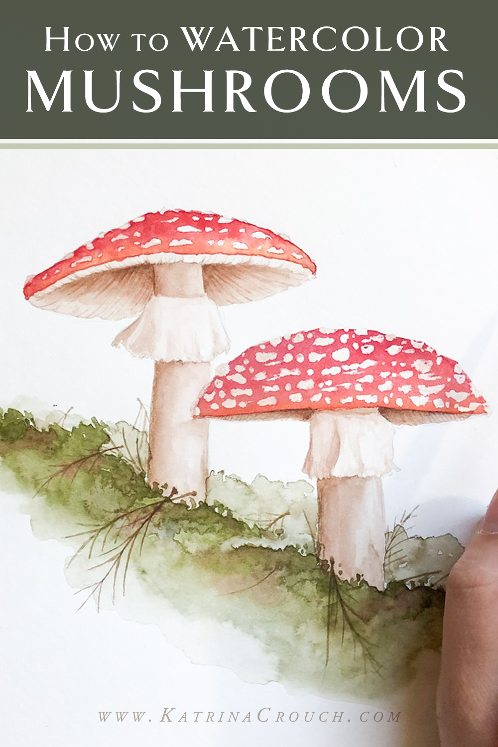
Loose Watercolor Peony - Watercolor Tutorial for Beginners
Last year I was asked to provide some artwork for the 2018 Bloom Bash, and the theme was “farm to table”. So each of the watercolor paintings that I created for the event featured fruit or vegetables among the flowers in the bouquet—it was a new challenge for me, but one that I ended up having a lot of fun with! Who would have thought I would mix beautiful watercolor peonies with radishes of all things? haha!
While most of my work is more realistic now, I was still exploring this area of my style and ended up going with a looser, more modern watercolor technique for these pieces. Thankfully, I DID film this painting process, though I had not started the art tutorial side of my YouTube channel yet, and am excited to share some of the behind the scenes with you now!
Again, I was new to the whole “art tutorial” filming technique, so the video footage is not as strong as some of my more recent work. But I think the beauty of loose watercolor flowers is the way the color bleeds and the use of negative space, and there is definitely something to learn from these more abstract paintings!
The key to loose, watercolor peonies is still the outline! But instead of being harsh and well defined, it is important to capture it in as few lines as possible. In many ways, it’s harder to work in this more abstract style! I like to give my brush a little wiggle at the top of the petals to allow the outline to become irregular and thus give the illusion of a nice, floppy petal! Then I also leave a small line of negative space (no paint) between where the petals overlap. Even though there is no empty space there in reality, it allows my eye to make sense of the “blob” that is on the paper.
Another tip is to play around with value (how light or dark something is). I always return to my flowers and add more pigment to the base of the petal, to show that it curves gracefully under. With a looser style, it is important to do this while the paint is still wet so that the pigment has a chance to fade into a more graceful gradient. It’s a beautiful effect!
After the peony was finished, I focused on creating more variety with the rest of the painting—adding smaller more pointed flowers, a pop of blue with some silver dollar eucalyptus, and then a pop of bright burgundy with some unexpected radishes! YES! Radishes! haha
VIDEO - 5 Tips for Painting Loose Watercolor Flowers: https://www.youtube.com/watch?v=ogFFXygdI04
Society6: https://society6.com/katrinacrouch/s?q=new
---Direct link to painting in video: https://society6.com/product/watercolor-radish-bouquet_print?sku=s6-9585109p4a1v45
PRODUCTS USED:
Brushes: https://amzn.to/2AdmzNb * (not the best, but they work if you’re just starting out! I would probably go for these if I was buying new: https://amzn.to/2MCkxfy
What I actually use:
Ivory Black: https://amzn.to/2QrlIfy
Chinese White: https://amzn.to/2Do8ux9
Cadmium Red: https://amzn.to/2SMmYvb
Alizarin Chrimson: https://amzn.to/2SMnJ7v
Burnt Umber: https://amzn.to/2SO1pdB
Raw Sienna: https://amzn.to/2SOXJbq
Yellow Ochre: https://amzn.to/2SO7VRI
Terre Verte (Yellow Shade): https://amzn.to/2Qh9Oo5
Sap Green: https://amzn.to/2qw9x5w
Ultramarine Blue: https://amzn.to/2SOV0ic
Indigo: https://amzn.to/2PDh8xz
Burnt Sienna: https://amzn.to/2PGVQix
Cadmium Yellow: https://amzn.to/2PKNrdK
Permanent Rose: https://amzn.to/2F2R9eN
If I were starting from scratch, this is the kit I would probably start with: https://amzn.to/2DouKXw
Strathmore 300 Paper: https://amzn.to/2JZ7jmN