
My Top 9 Calligraphy Fonts for Wedding Invitations
It’s hard to believe that I’ve been in the wedding industry for almost a decade. While I’m not designing custom stationery at this point in my life (3 little boys at home is making delicate styles of work less desirable for now), I still love to dive into wedding stationery in smaller ways. Through my illustrated wedding collections, through all the wax seal designs I can get my hands on or even through sites like Minted who can help my brides in ways that I just can’t anymore.
One thing that I love staying on top of is the different fonts for wedding invitations. I am pretty picky about the fonts that make it into my “tool kit”, so I’ve kept my list of wedding invitation fonts tight over the past few years. But today I’m excited to lend a little hand to my wedding stationer friends out there and share the fonts that I believe are the best calligraphy wedding invitation fonts on the market right now!
What I look for in a wedding calligraphy font:
I have a fine art, classical style that has a lot of old world whimsy to it—but that whimsy needs to be present! I don’t like fonts that are too traditional or regular. I want personality thrown in there.
It has to be readable. If I am struggling to read something, then the font is not a good fit for a wedding. Some things are pretty and not functional. Wedding stationery needs to perform a function, so readability is important.
The weight is very important too for wedding stationery calligraphy fonts (and wedding fonts in general). It has to compliment the style of art that I work with and not overpower the suite, but be able to take center stage if the design calls it to.
I love stylistic alternatives. Some fonts have them, but not all do! So I try to keep an eye out for additional formats because they are a great way to highlight important elements (like names or titles on stationery/day of goodies)
Enough chit-chat—let’s dive into the fonts (in no particular order):
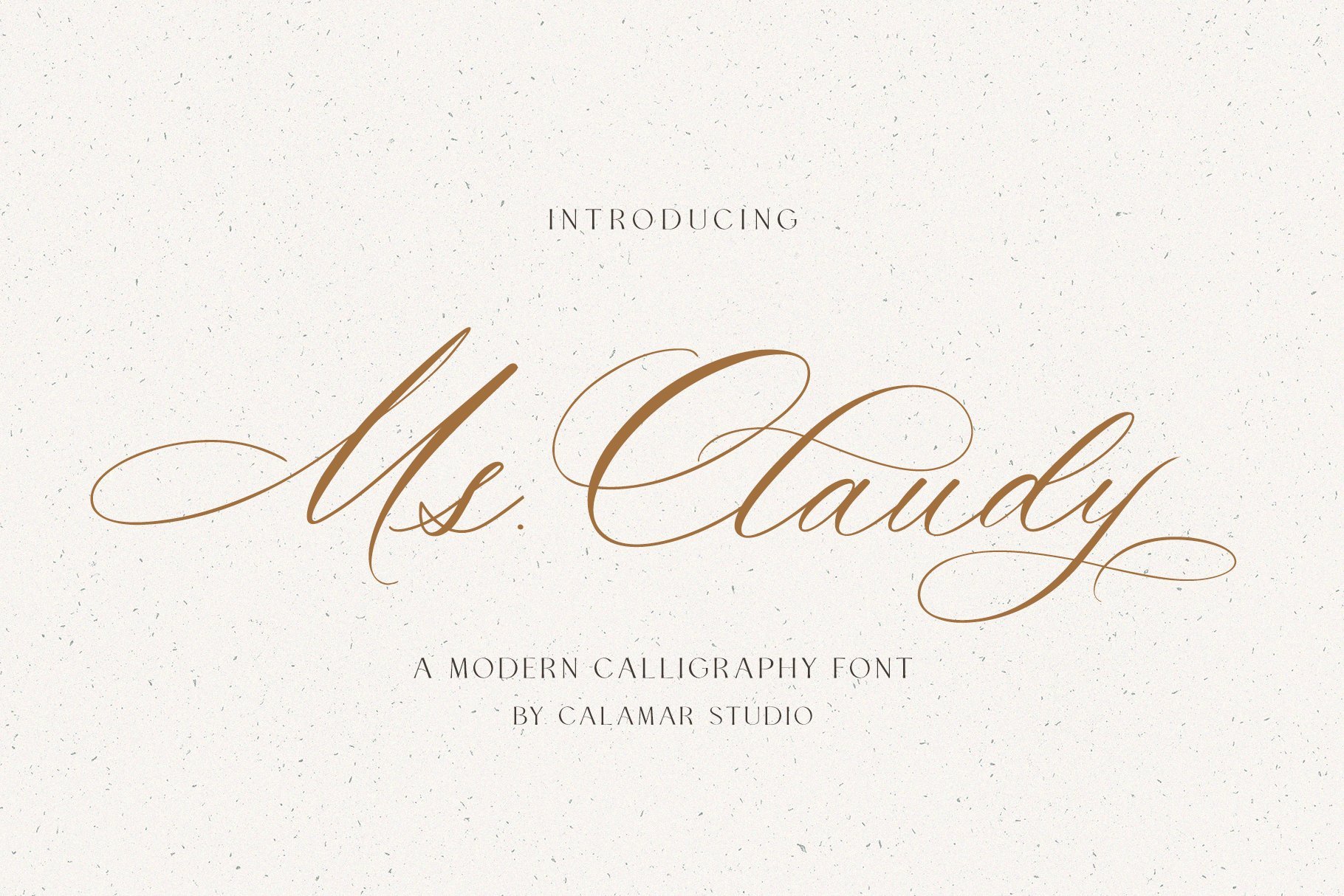
1: Ms Claudy by Calamar Studio
Isn’t she a beaut? I love the whimsy of this calligraphy font—it’s delicate and feminine without being too light or unreadable. There are a number of alternate letters that can be switched out for different uses and I love how you can customize the font in that way. While this list is not in order of most-to-least favorites, this is definitely in my top 5 for best calligraphy fonts for wedding stationery!
And spoiler alert? You’re see Okana’s work in this list a few times—she knows what she’s doing!


2: Mozart Script by Blessed Print
This is among my “most used” fonts. It’s great for a more regal feel and stately venue. Working in high end stationery, my clients wanted the elegance of their event to be expressed in their stationery without sacrificing the pretty flourishes. This calligraphy font is a great option for weddings that are looking for some old world structure and stately presence, but with a little bit of fun and grace thrown in.
Above you can see an example of Mozart Script in action for one of my wedding invitation suites. I love how it complements the style of illustration and delicate lines but is easy to read and pretty.
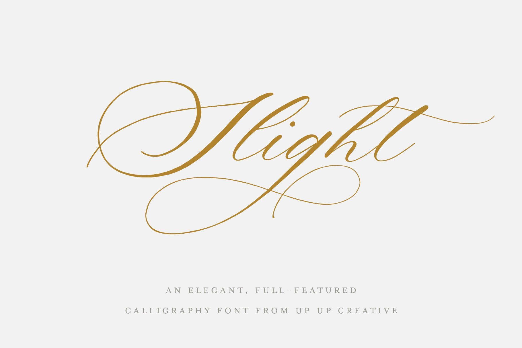
3: Slight by Up Up Creative
Another favorite calligraphy font, I have used Slight a lot in recent projects. It’s elegant but effortless. It is not as structured or historic as Mozart Script, but I think that’s what I love so much about it. It’s less “loopy” then Ms. Claudy. This gives it more of a handwriting feel, but it’s definitely not a casual font. Just effortless.
Up Up Creative is another shop that is worth a follow because just about everything she releases makes my jaw drop—even if it’s not my style. At the time I’m writing this, she just released “Coax” and even though it’s really not my style, I kept adding it to my cart because it’s just so pretty! haha


4: Adora Bouton by Peach Creme
This font makes me think of lace for some reason! It is especially beautiful with a more sketchy style illustration or something that mimics the whimsy and elegance of lace. It also pairs nicely with a lot of white space to balance out the movement and visual texture, so I often use it with a more modern style type setting so that it can really shine (example from my own work above).

5: Modern Symphony Font Duo by Calamar Studio
I probably should have mentioned this in my “rules” for fonts, but it’s not a deal breaker for me so I’m leaving it out… I LOVE font pairings. It makes life so much easier and I can kind of go on auto pilot. In this post we’re going to focus on the calligraphy side of this font duo, but just know that I love a good duo! Modern Symphony script is a beautiful calligraphy font for a very light and dainty feel. It’s pretty fixed in width and LIGHT, so it’s not great for smaller text, but it’s really pretty if you want a large script that doesn’t feel heavy even if it takes up a lot of design space.
Spoiler alert: Modern Symphony Serif is included in my top serifs for wedding stationery (or branding or life in general, honestly)
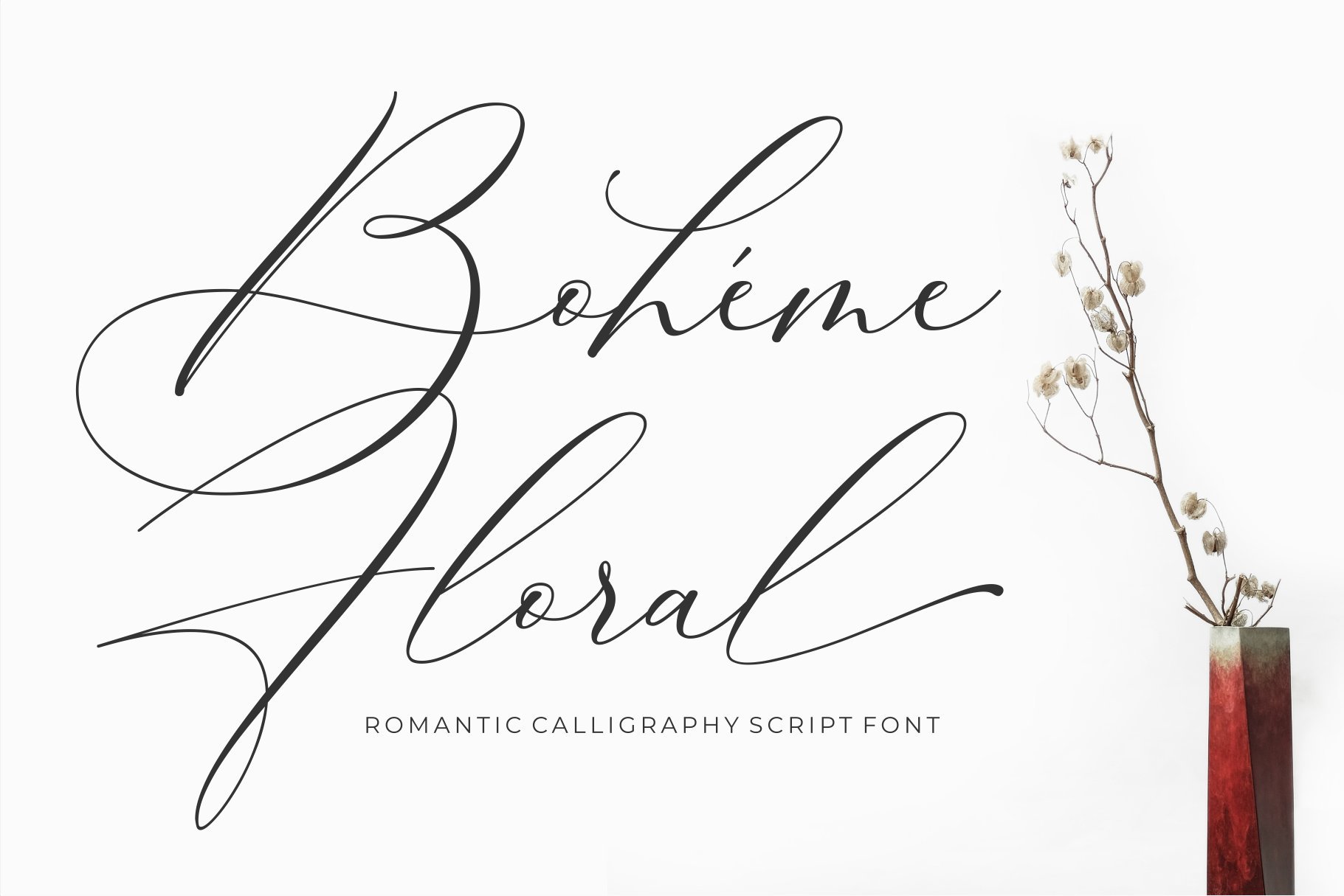
6: Boheme Floral by 50Fox
This is another “older love” that I almost didn’t include because sometimes I feel like I’ve grown out of it. However! I still find myself pulling out once in a while. It’s a little more wild and swoopy then I usually use with the extra large capital letters and minimal swashes throughout, but the fact that I’m still pulling it out occasionally after all these years of having it in my “calligraphy font tool box”, if you will, definitely means something! It has a similar feel to Adora Bouton, so if you love that one you’ll probably like this one too!
I find that this script font is best used for a more casual event—more of a garden wedding or a bridal shower style of invitation rather than a stately black tie wedding. But the beauty of fonts is that it’s only a piece of the puzzle! If you love it for a structured event, just make sure that the rest of the elements in the stationery point towards that theme.

7: Ecatherina by Blessed Print
Another more structured font (like Mozart Script) but with some absolutely beautiful swashes. In preparing for this blog post, I discovered that the creator dedicated this font to his wife (named after her) and I can see why! It’s elegant and has a presence that demands attention. This one is more traditional in nature but not boring in the least and I think that’s another reason that I like it so much! Larger capital letters, but the exaggerated ascenders and descenders make it fit a little more gracefully then in Boheme Florals (which I would say is definitely a more casual font)

8: Modernist by Calamar Studio
If you’re looking for hand lettering in an elegant format, this is it! There is no denying that this font is beautiful. It is probably one of the most illegible on the list, and some of the capital letters aren’t my favorite, but I really really love this font when it’s a good fit so I couldn’t make a list of favorites without including it!
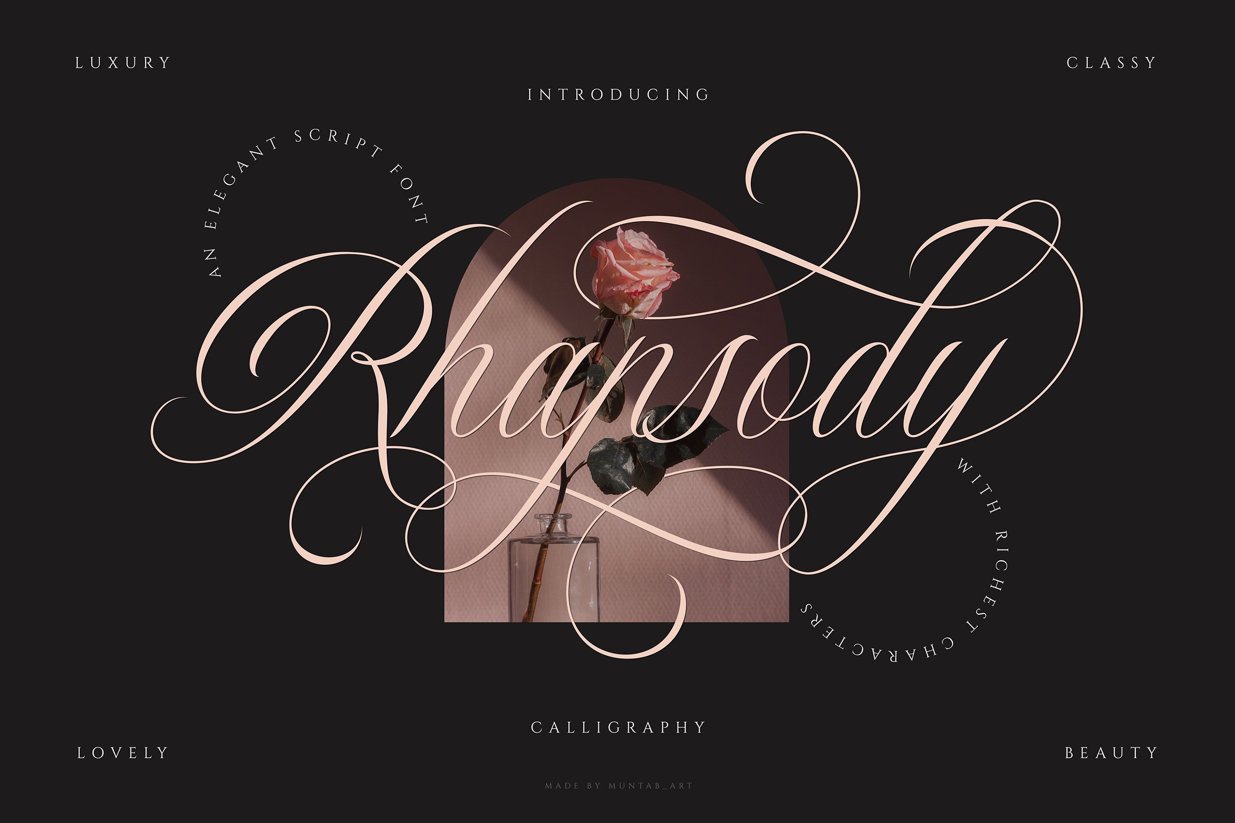
9: Rhapsody by Muntab Art
This is a newer font for me and a little outside of my usual wheelhouse, but it’s so fun that I thought I would include it anyway! Similar to Mozart, this font has a very historic vibe and follows traditional “rules” and therefore has a more formal feel overall. I appreciate the stylistic alternatives and the fact that the capital letters fit the size more (unlike Ecatherina, that has the exaggerated capitals).
So why stop at 9?
Honestly, because I feel like throwing in another font just to make it an even 10 is unnecessary. I mean, I COULD, but do you really want to hear me make something up? Nah, these are my honest thoughts and the fonts that I really do turn to when I’m working on a stationery suite. I’m updating all the time and trying new things (or dreaming of an excuse to explore more, let’s be real) and you can follow along with my current calligraphy font list here.
Anything you think I left out? Let me know in the comments below and I’ll try it!


